Signature Malaysia

Room Colour Ideas for Modern Living

Key takeaways

  • Wall colour is one of the most impactful renovation decisions, and choosing it after your flooring and furniture are fixed prevents mismatches that are hard to correct.
  • Living rooms suit warm neutrals with one accent surface, dining rooms suit richer earthy tones, and study rooms suit calm, soft colours.
  • In a small room, stark white is not always the answer, as a warm neutral or a single deeper feature wall often makes the space feel more considered.
  • In an open-plan home, choose colours that share the same warmth or coolness, and test any colour at full scale and at different times of day before committing.
  • Signature Malaysia‘s cabinetry comes in a range of finishes, so settle the finish first and choose the wall colour to suit it.

Introduction

Colour is one of the highest-impact and lowest-cost changes in a renovation. In a modern Malaysian home, the right colour does more than decorate a wall. It shapes how a room feels, how large it looks, and how it connects to the rest of the home.

This guide covers room colour ideas for the living room, dining room, study, and small room, how colour affects the feel of each space, how to choose colours that flow between connected rooms, and the mistakes to avoid. Wall colour decisions work best made after your flooring and large furniture are decided, not before.

For bedroom colour ideas, read: Bedroom Colour Ideas & Inspirations For The Feel You’ll Love.

How does colour affect the feel of a room?

Colour affects how large a room feels, how much light it holds, and the mood it creates, making it one of the most practical decisions in a renovation, not just an aesthetic one.

  • Lighter colours reflect natural light and make a room feel more open. Darker colours absorb light and create warmth and cosiness, useful in larger rooms or as a deliberate feature wall in a compact space.
  • Warm tones such as terracotta, amber, and warm beige are often used in spaces designed to feel welcoming and social. Cool tones such as sage green, soft grey, and muted blue are often used in spaces designed for focus or rest.
  • In an open-plan layout, the colour of one zone affects how the adjoining zone reads.

What colours work in a modern living room?

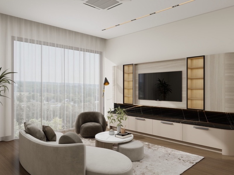
Modern Malaysian living room with warm off-white walls and a dark accent TV consoleModern Malaysian living room with warm off-white walls and a dark accent TV console.

For modern living room colour ideas in Malaysia, start with a warm neutral base and one accent surface in a deeper or more distinctive colour.

  • Warm off-white and warm beige: A reliable base. The tone shifts through the day, so check it in your own room’s light. Works with wood-tone cabinetry, white trim, and most furniture finishes.
  • Sage and muted green: Suits homes looking for a calm, nature-connected feel. Works well as a living room base or feature wall, particularly alongside natural wood tones and off-white trim.
  • Warm grey and greige (a blend of grey and beige): Versatile and forgiving across lighting conditions. Avoid cool or blue-leaning greys, which can read harsh in Malaysia’s strong natural light.
  • Charcoal or dark tone feature wall: Effective behind a TV console or sofa wall in a larger living room. In a smaller living room, limit dark tones to one wall only.

For modern living room ideas, read: Modern Living Room Design Ideas & Inspirations You’ll Love.
What colours suit a dining room?

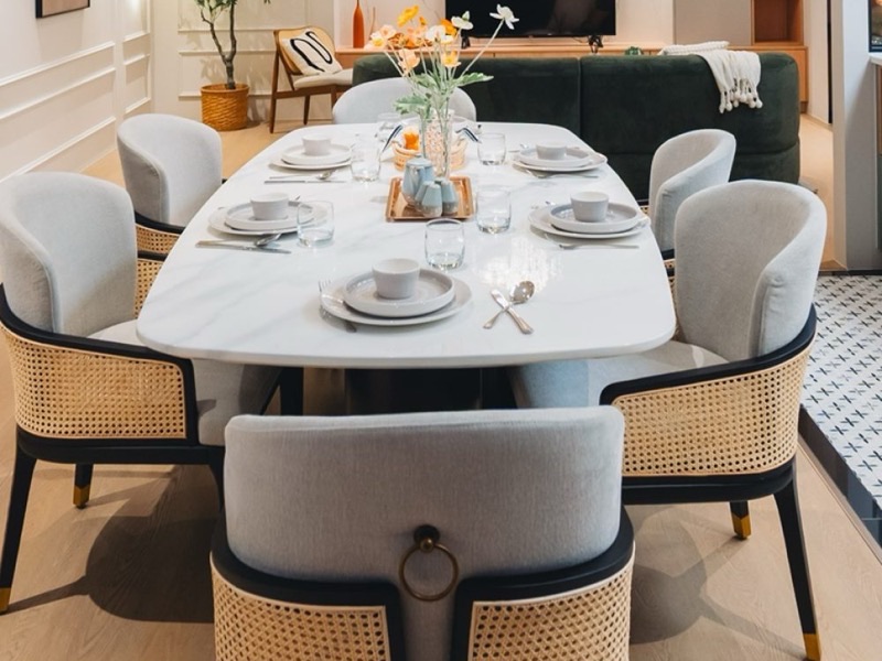
Malaysian dining room with rattan-backed chairs, a marble dining table and warm neutral wallsMalaysian dining room with rattan chairs and warm neutral walls.

For dining room colour ideas, lean towards colours that feel warm and social. Richer tones create a sense of occasion, especially on one wall rather than all four.

  • Terracotta and warm earth tones: Work well in dining areas, creating a warm atmosphere for both everyday meals and gatherings. Pairs well with natural wood furniture and rattan accents.
  • Deep green or forest tones: A richer alternative to sage green. Works particularly well with higher ceilings or good artificial lighting.
  • Warm amber and ochre: For homeowners who want colour with warmth and personality. Works best as a feature wall, balanced with off-white trim and neutral furniture.
  • What to avoid: Very cool or stark tones as the dominant colour. Pale blue, cool grey, or stark white can make a dining space feel less inviting.

For dining room ideas, read: Dining Room Ideas & Designs You’ll Love.
What colours work best in a study room?

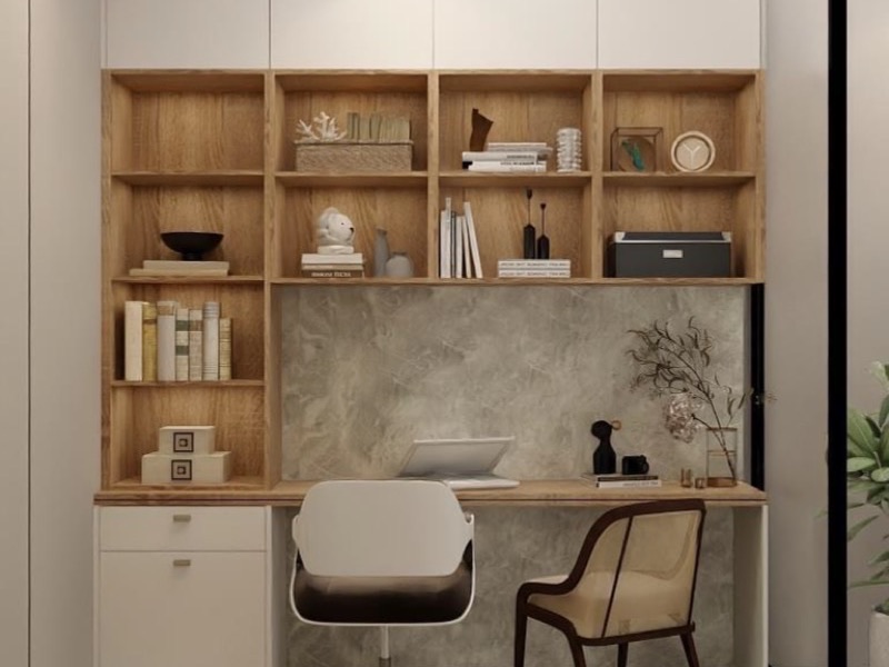
Malaysian study corner with a warm grey feature wall, built-in wood shelving and a deskMalaysian study corner with warm grey walls and built-in wood shelving.

For study room colour ideas, choose calm, muted colours such as soft greens and warm neutrals, which suit home offices and study corners in modern Malaysian homes.

  • Warm white or soft cream: Keeps the room spacious and well-lit for extended time at a screen. Avoids the harshness of stark white under artificial light.
  • Muted olive or soft green: Often used in study spaces designed to feel calm and focused. Enough warmth to avoid feeling cold, enough depth to feel grounded.
  • Warm grey: Recedes from view without making the room feel blank. Pairs well with dark wood or black-framed furniture.
  • What to avoid: Very bright or vivid colours in a workspace. Some homeowners find vivid colours become tiring over extended time.

For study room ideas, read: Study Room Design Ideas for Small & Large Spaces.

Do small rooms always need light colours?

For small room colour ideas, the answer is not always to go light. In a small room, including the compact bedrooms and studies common in Malaysian condominiums, colour choice can make the difference between a space that feels intentionally compact and one that feels cramped.

  • Light warm neutrals: Warm white, cream, and light beige reflect light and make the room feel bigger. The key is warm: a cool or grey-white can make a small room feel colder and more enclosed.
  • Feature wall: One deeper colour on the wall furthest from the entrance can add depth. Avoid feature walls on side walls in very narrow rooms.
  • What does not work: Dark colours on all four walls in a room with limited natural light. These tend to make small rooms feel more enclosed.

How do you choose colours that flow between connected rooms?

In an open-plan home, choose colours that share the same warmth or coolness, known as their undertone, even if the colours themselves differ.

  • Undertone: The underlying warmth or coolness of a colour. If the living room leans warm, carry that warmth into the dining area even if the colour changes. Mixing warm and cool undertones can make spaces feel slightly off even when each colour looks right individually.
  • The 60-30-10 guideline: A common interior design guideline suggests 60% dominant colour across walls, 30% secondary in furniture and soft furnishings, and 10% accent in cushions, artwork, and plants.
  • Transition points: A structural column, a change in flooring, or a built-in unit can allow a colour shift between zones without it feeling abrupt.

What colour mistakes do homeowners make when renovating?

The most common colour mistakes come from choosing in isolation: from a small swatch, under showroom lighting, or without considering how natural light changes through the day.

  • Choosing from a small swatch: Colours look very different at scale. Test with a large painted patch before committing.
  • Not accounting for Malaysia’s natural light: Colours that look balanced in a European showroom can read very differently here.
  • Choosing wall colour before flooring and furniture: Wall colour works best chosen last, because matching walls to a sofa or cabinet that may change makes them feel disposable. Signature Malaysia‘s cabinetry comes in a range of finishes, so settle the finish first, then choose a wall colour to suit.
  • Going too light in a small room: All-white rooms with limited openings can feel flat. A warm neutral or soft, deeper colour often does more.
  • Ignoring the ceiling: Ceilings painted stark white by default can feel unfinished. A slightly off-white ceiling in the same colour family makes a room feel more complete.

Frequently asked questions about room colour ideas

What is the best base colour for a modern Malaysian home?

Warm off-white, warm beige, or greige are among the most reliable starting points. They tend to be forgiving across lighting conditions and pair well with many cabinetry finishes.

Yes, usually on one wall rather than all four. A dark feature wall on the wall furthest from the entrance can add depth without making the room feel enclosed.

A common interior design guideline suggests three colour families: one dominant colour for walls, one secondary for furniture, and one accent for cushions, artwork, and plants.

Not always, but a slightly lighter version of the wall colour, or a warm off-white, is a safe choice. It gives the room a more finished feel without darkening the space.

Yes. Natural light changes how a colour looks through the day, and in Malaysia’s strong light, cool-toned colours can read harsher. Test any colour on your wall at different times of day before committing.

Conclusion

The right base tone sets the foundation for each room. Colours that share an undertone keep an open-plan home feeling cohesive. Start with flooring and large furniture, then work outward to the walls.

If you are planning a renovation, speak to the team before finalising your colour palette, or explore Signature Malaysia‘s collections to see how colour works across kitchen, wardrobe, and living space concepts.